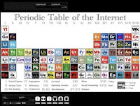
TOKYO- This is perhaps one of the most concise and best structured summaries of the 2009 technology world. New version of the Web Trend Map.
A yearly publication mapping 333 web domains, and 111 influential people on a Tokyo Metro map. Read more or download it here
Each “line” on the map is a different category: Application, Publishing, Opinion, News, etc. The map is certainly overwhelming, but pretty fun to explore. You can even send IA an email now to reserve your copy of the printed poster.
Heights represent success in traffic and branding. Subway lines are colored by area of interest. For example, take the orange line to find the creatives. Notice that there are several colors passing through Apple.
No comments:
Post a Comment